5 Ways to Style Your Org Chart
Visually transform your org charts with these styling tips. Highlight key details, showcase your brand, and make team structures instantly clear at a glance.
1. Choose Your Chart Box Content
Using TeamOrgChart’s box content settings, you can customize the information displayed in chart boxes across your org chart. Keep it simple with just a name and job title, or include contact details to make connecting easier.
Highlight key information and add visual hierachy to your chart boxes by changing font sizes and applying styles such as bold, underline or italic.
2. Apply Custom Colors
Create a professional and visually engaging org chart by customizing the colours applied to chart boxes. Choose your chart box's border and text colors, selecting from a range of default options or apply a custom hex code to align your org chart to your organization’s visual identity.
3. Set Your Chart Box Layout
Customize the layout and size of your chart boxes, choose to include a profile picture, availability or prioritise contact information.
You can also set the size of your chart boxes, which is particularly helpful for large or complex organizational structures, allowing you to display an overview all on one page. Pick from a selection of default sizes or define your own.
4. Create Conditional Styling Rules
Apply logic based rules to change the appearance of your chart boxes depending on the information they contain. This powerful feature enable TeamOrgChart to automatically update your chart based on real-time data changes and assists the quick identification of patterns within your organisation’s structure.
Frequent uses for conditional styling are to highlight levels of seniority, distinguish temporary staff and flag individuals with certain qualifications.
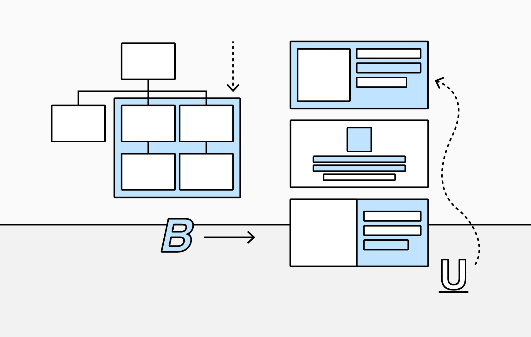
5. Group With Backgrounds
Highlight groups with a custom background, making it easy to identify people and teams at a glance. Customize the background colour, border style, and direct report layout to suit your organizational structure.